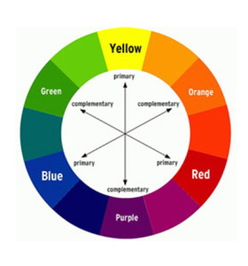
 Having trouble picking colors that go together? Do you know your favorite color but can’t come up with a good color scheme? One tool that can help is the color wheel.
The first color wheel is attributed to Sir Issac Newton, who placed colors in a natural progression on a rotating disk in 1706. When the disk rotates rapidly, the human eye blurs the colors together into white. The wheel has been used by both scientists and artists in the study of color. Fortunately for us, we don’t have to be either in order to understand and use the color wheel. It is a simple tool based upon the color concepts we learned in elementary school.
There are three primary colors – red, yellow, and blue. The wheel starts out as a triangle of these three colors: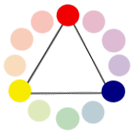
There are three secondary colors formed by combining each of the primary colors – orange, green, and purple. These colors slide in between each of their parent colors, creating an inverted triangle:
In between each of these points are the six tertiary colors, such as blue-green, yellow-green, etc.:
 Together these form the twelve points of the common color wheel:
 Did you ever wonder why red & green seem to work so well as holiday colors? That is because they are opposites on the color wheel, giving the most contrast. Opposite colors are known as complementary colors:

Colors that are adjacent to one another on the wheel have the least amount of contrast and provide a very harmonious color scheme. These adjacent colors are called analogous colors:
 Using the color wheel as a starting point can be very helpful. In future we will continue to explore what it can show us about color as a design tool.